Mother's Day Weekend!
Take an extra 9% OFF with code: LOVE
Take an extra 9% OFF with code: LOVE

 Give a Cheer
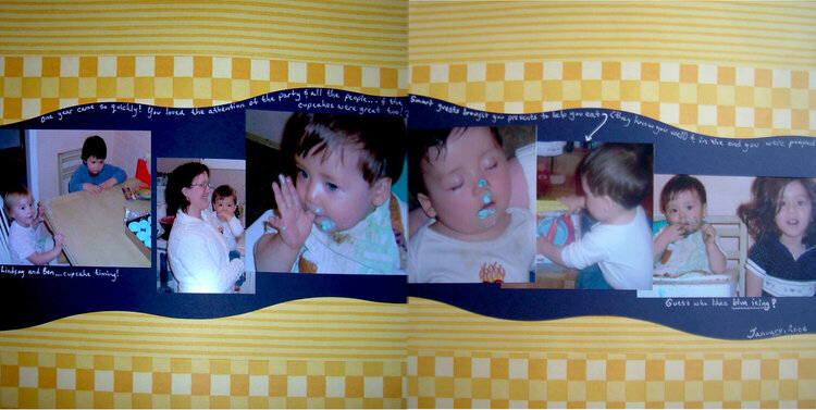
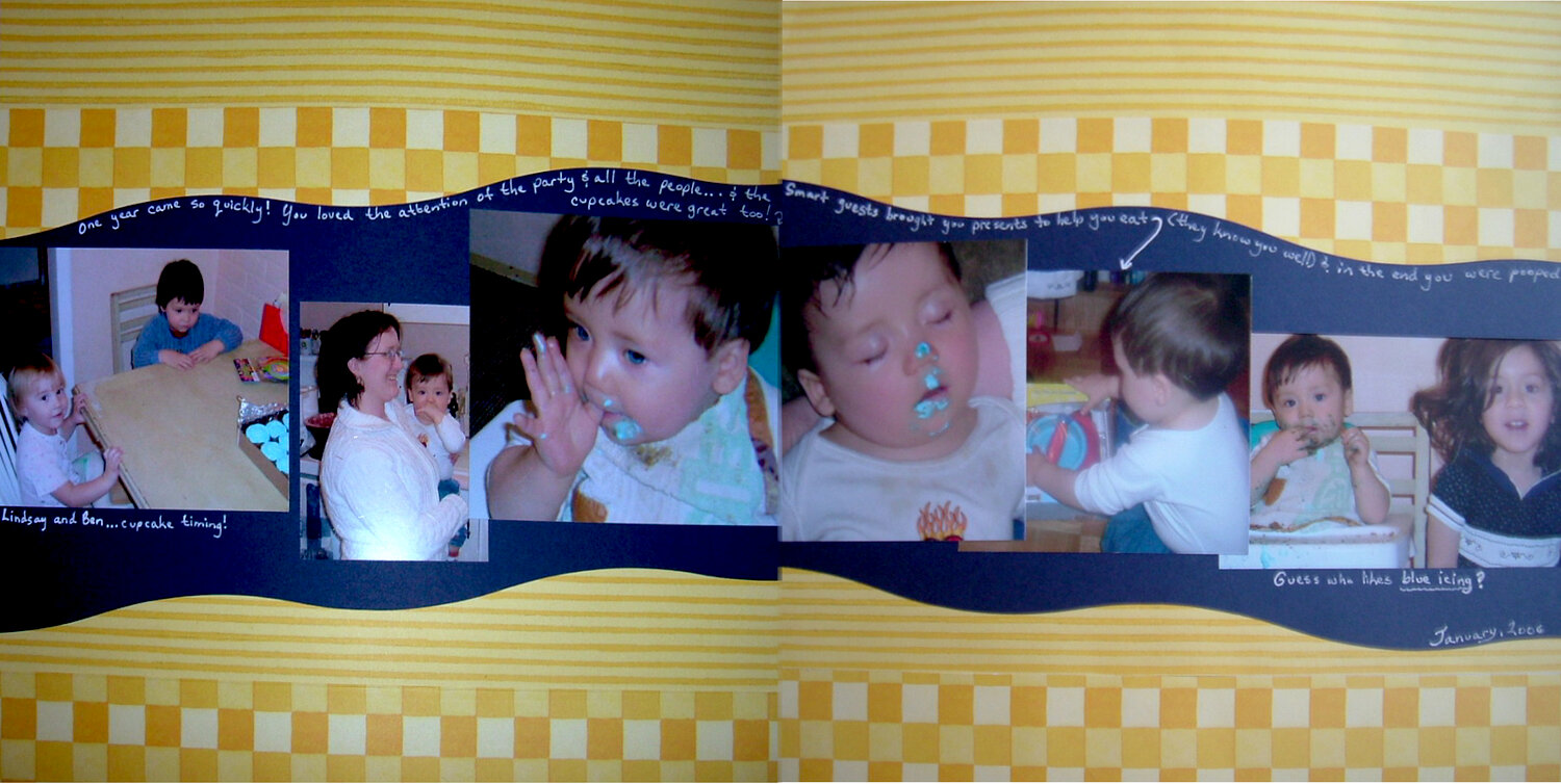
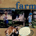
This is the spread panaroma. I was working on this for the Scrap Happenzz photo placement challenge but, with that piece of the l/o done, I'm now *stuck* and really looking for ideas to finish this off. I want to keep it uncluttered and clean *but* have lettering with a "wow" to it....thinking maybe hand-cut in the same colour pp as behind the photos but not sure. Any other ideas for final touches would also be very welcome! (I wish I could have gotten this to line up better online...the lines are spot-on in real life).
No products have been added to this project.
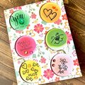

Thanks for spreading positivity!


April 12, 2007
March 28, 2007
March 21, 2007
March 20, 2007
March 19, 2007
March 19, 2007
March 19, 2007
March 18, 2007
March 17, 2007
March 17, 2007
March 17, 2007
March 17, 2007
March 17, 2007
March 17, 2007