FREE Standard Shipping on Orders $69+ with code:
FREESHIPPING

Cheers
Give a Cheer

 Give a Cheer
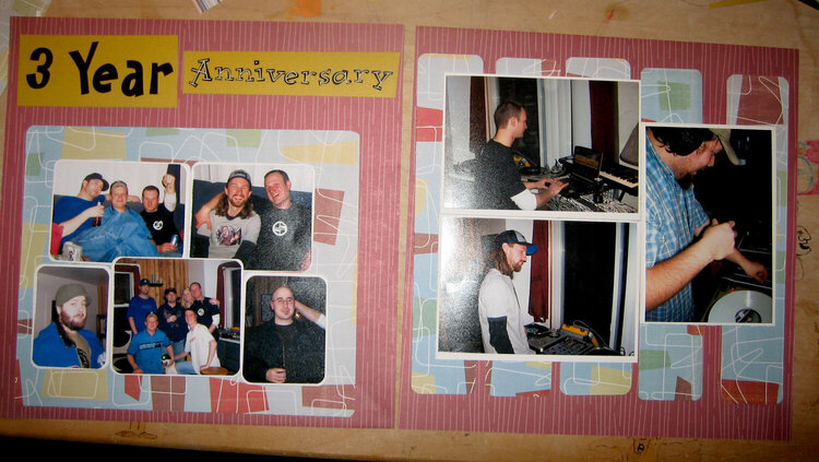
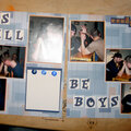
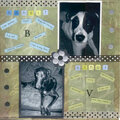
I wasnt going to do any journaling on this one, but wondering now if I should. Also should I round the photos on the left side? Nothing is stuck down.
No products have been added to this project.


Thanks for spreading positivity!


April 05, 2007
April 05, 2007
April 05, 2007
April 05, 2007
April 05, 2007
April 05, 2007
April 02, 2007
April 02, 2007
April 01, 2007
April 01, 2007