That is an awesome panorama shot...not everyone knows how to shoot those! I love the background paper and you have another vote from me to keep the bracket as is. I really love the torn paper effect to create the beachy feel on this series.
I love that bracket, but would take the punches off here as well. I also would like to see that net like paper from the other page onto this one under the journaling. Im thinking maybe if you flip the bracket, you could add another bracket on the left side of the title, so the brackets are around the title, and journaling box.
That place is beautiful!
You could remove the punches if you were also willing to remove the blue cs wavy borders and replace them... just thinking out loud. I also like the bracket as is.
I'm not even going to read the comments below so if I repeat, sorry. I can totally see you bigging up that journaling strip above the lower pics to take up some of that space. I can also see 2 page turns down in the left hand corner of your journaling block, from the left edge going in, about 1/4 of an inch apart (or maybe a little less) facing up toward the writing. Why two? I don't know... just what I'm seeing there. Also, some hemp or thin twine wrapped around the top portion of the bracket and tied in a simple knot with a seashell hanging from or attached to it. Noting too bulky, just a little something. Or a sandcastle or a seashell charm. I attach these with O-rings on a safety pin, but you don't have to. Again, you would have to do more punches and continue it onto this page, obviously. Oh, and I would have made the bracket face in toward the pic and overlap the pic a bit.... very nice. This LO really has a calming effect! I was sitting here having chest pains from too much stress and coffee and now, I am totally better!!
Sorry to be controversial here, but don't listen to those peeps. I like the way the bracket is. Makes me think all of this (open end to the vastness) summed up here (point to the journaling block). I'm also good with the tilt of the journaling block. To reiterate, love the batik paper!
Great photos again! I think you should move the strip with the journaling more to the right, lip the bracket so it points to the photo and straiten the journaling block.
I really like the placement of the pics and the paper tearing. I personally would flip the bracket so the point of it is pointing to the photo. But otherwise great job!
I'd straighten the journaling block up a bit, and definitely move that bracket to the other side of the photo. I love how you pieced together the photos.. great idea.
Okies this page has AWESOME photo placement. Bang on. My eyes flow across the page and make me want to BE there so much. I would place the brackt on the other side of the photo and place that photo in more to make room for the bracket. I wouldn't have matted the journaling block to match the strip at the bottom. Your photographs are just beautiful, awesome job!
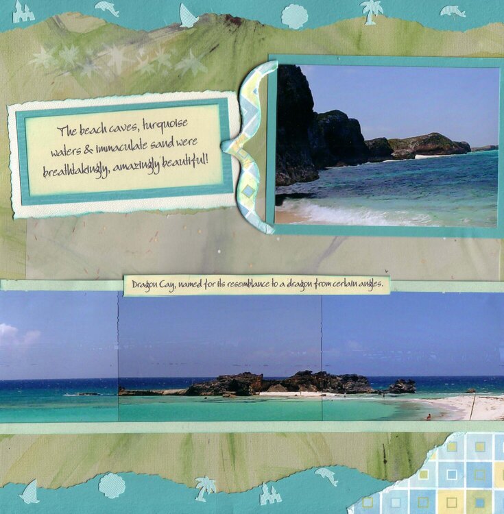
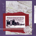
Part of the Middle Caicos Excursion we took on our honeymoon. This is one of two 2 pg LOs I did on Mudjadin Harbour, which was arguably our favorite part of the honeymoon (besides the wedding). I like the "Part 2" LO more than this one, I think "Part 2" captures the elegant, peaceful feeling I was going for better than this one does. While I like this LO, I think the punches make it more "adorable" than I want but I tried to Un-du them off & they're so anchored down that despite the Un-du, the background paper was tearing. So I accept this LO but am open to improving it, since this was such a special event to us.
Does this project or one of it's images contain pornography, profanity, or other illegal or offensive material? If so, please report it and our moderators will come by and clean it up in a flash.
August 16, 2009
August 16, 2009
August 16, 2009
August 16, 2009
August 16, 2009
August 16, 2009
May 03, 2007
April 29, 2007
April 18, 2007
April 17, 2007
April 17, 2007
April 16, 2007
April 16, 2007
April 16, 2007
April 16, 2007
April 16, 2007
April 15, 2007
April 15, 2007