

Scrapbook.com Exclusives 20% to 60% OFF
Plus, Take 10% OFF Orders $100 or More! Use Code: CRAFTY
Plus, Take 10% OFF Orders $100 or More! Use Code: CRAFTY

 Give a Cheer
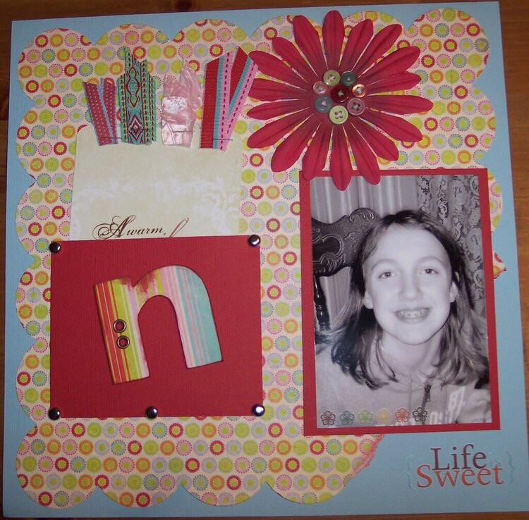
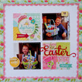
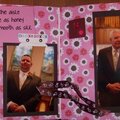
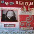
A layout of my neice. the journal card pulls out

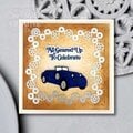
Thanks for spreading positivity!


July 04, 2007
June 26, 2007
June 25, 2007
June 25, 2007
June 24, 2007
June 24, 2007
June 24, 2007
June 24, 2007
June 23, 2007
June 22, 2007
June 22, 2007
June 16, 2007