
Happy National Scrapbook Day!
Extra 10% OFF Select Scrapbooking Brands with Code: NSD24
Extra 10% OFF Select Scrapbooking Brands with Code: NSD24
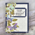
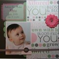
 Give a Cheer
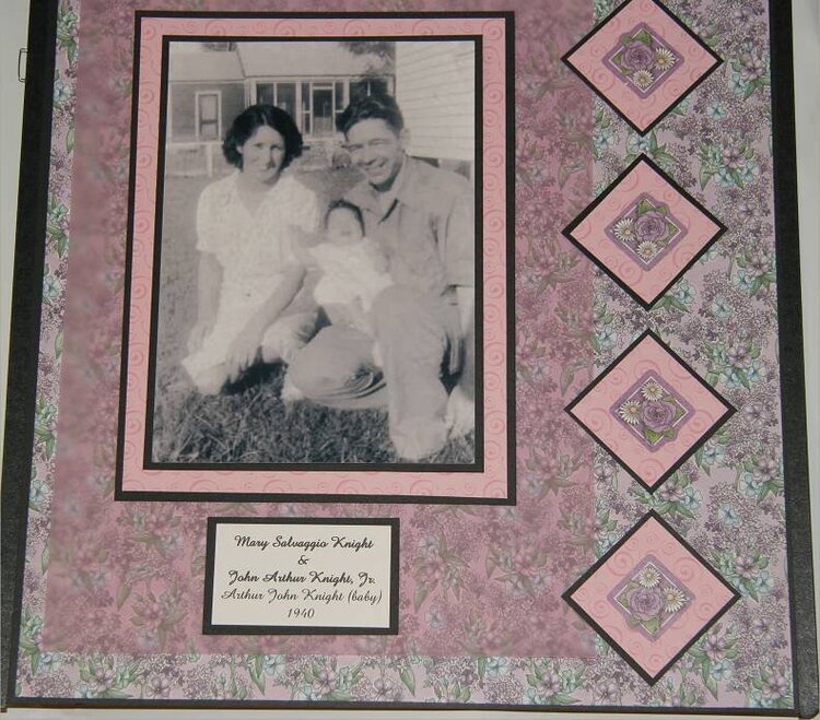
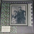
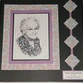
Continuing in my Heritage Album... All photos in BW with Patterned Papers and cardstock in shades of Purples, Pinks, Browns and Black. Housed in a CM Rose Tapestry strap-hinged album.
No products have been added to this project.
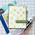
Thanks for spreading positivity!


June 26, 2007
June 21, 2007
June 20, 2007
June 20, 2007
June 20, 2007
June 20, 2007
June 19, 2007
June 19, 2007
June 19, 2007
June 19, 2007
June 19, 2007
June 19, 2007