
Cheers
Be the first to cheer this project!
Give a Cheer
Be the first to cheer this project!

 Give a Cheer
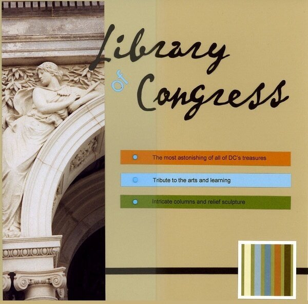
**Sorry the scan sucks–the color on the right half of the layout is most accurate.** Another cut out title. This whole layout was inspired by that KI Mod Blox in the bottom right corner. During our trip to DC two years ago I was using my parent's 35mm camera and didn't realize that it was set to panarama…meaning I have a bunch of very long photos! I really love the way this one came out, though. I was so impressed by the Library of Congress that I felt it deserved it's own layout, even though I didn't have much to say about it! Fonts: Arial and P22 Vincent. Thanks for looking!
No products have been added to this project.


Thanks for spreading positivity!