
Happy National Scrapbook Day!
Extra 10% OFF Select Scrapbooking Brands with Code: NSD24
Extra 10% OFF Select Scrapbooking Brands with Code: NSD24

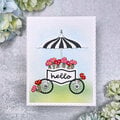
 Give a Cheer
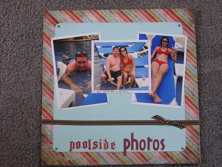
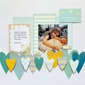
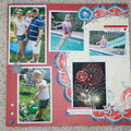
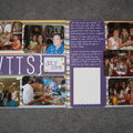
Ryan and I in Mexico.
No products have been added to this project.
Thanks for spreading positivity!


April 06, 2008
March 03, 2008
February 23, 2008
February 23, 2008
February 21, 2008
February 20, 2008
February 20, 2008
February 19, 2008
February 18, 2008
February 18, 2008
February 18, 2008
February 18, 2008
February 18, 2008
February 18, 2008
February 17, 2008
February 17, 2008
February 17, 2008
February 17, 2008
February 17, 2008
February 17, 2008
February 17, 2008
February 17, 2008
February 17, 2008
February 17, 2008
February 17, 2008
February 17, 2008