FREE Standard Shipping on Orders $69+ with code:
FREESHIPPING

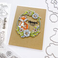
Cheers
Give a Cheer

 Give a Cheer
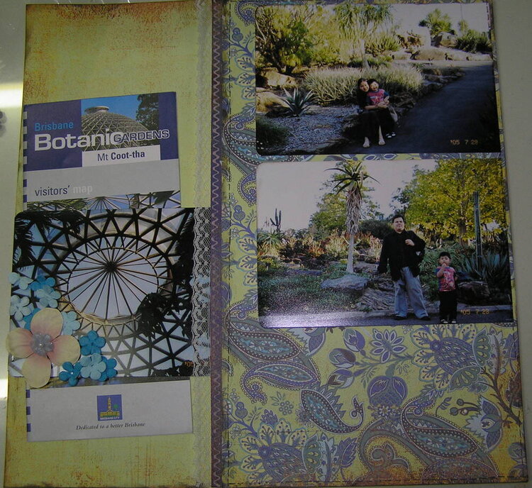
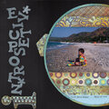
I still don't know what title to put here. I have so many garden pages, I've run out of titles :( Any ideas? I was thinking of placing a rub-on definition in the upper left corner, but I don't know what's appropriate. I presently have definitions of travel and journey, and I think, escape too. The flowers are not stuck yet, that's why I just used my camera. Of course, I'm also getting lazy with my scanner. :) I was planning to place the title at the lower right.
Products:
Technique Tues Hanging by a thread-yup it's new!!
Acrylic paint
BG Skate Shoppe pps
lace
MM hydrangea
primas
Tim Holtz distress ink
No products have been added to this project.

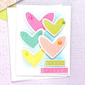
Thanks for spreading positivity!


April 01, 2006
March 28, 2006
March 17, 2006
March 17, 2006
March 16, 2006
March 16, 2006
March 16, 2006
March 16, 2006
March 16, 2006
March 16, 2006
March 16, 2006
March 16, 2006
March 16, 2006
March 16, 2006
March 16, 2006
March 16, 2006