

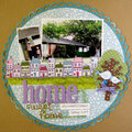
Quick Look


Cheers
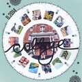
Give a Cheer

 Give a Cheer
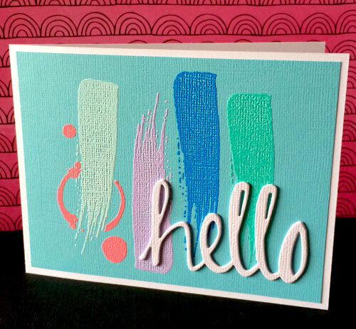
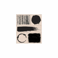
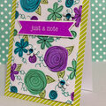
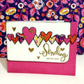
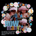
When clearing up my scrap table last week, I saw the cover of a Garnet Hill catalog that totally inspired this card. I couldn't wait to mimic the look with heat embossed powders. I don't know about you, but I have them in way more colors than I really should. Ironically, it turns out I didn't have as many shades of blues as I could've used for this card, lol.
The attached image is of the catalog cover. I was really intrigued by the cover art as it was lots of blue on top of a blue background, which one would expect to be visually "flat", but I thought it was quite striking. What also intrigued me is that I typically see colored embossing powder on a white background so I wondered if having a colored background would provide enough contrast.
Since there were so many heating steps to make this card front, I decided to go ahead and make 4 of them. I'm glad I did because I really like the way it looks with a die-cut sentiment in white. I completed this one with a "hello" sentiment but the others I'm leaving plain and will cut what the situation calls for when I go to use them.
I can't wait to have the time to play with this design in a different color family and see if I love the results as much. tfl!
Thanks for spreading positivity!


August 08, 2014
August 04, 2014
August 03, 2014
August 03, 2014
August 03, 2014