Stamps, Inks, & Stamping Accessories on SALE!
Take 9% OFF orders $100 or more with code: SPRING
Take 9% OFF orders $100 or more with code: SPRING

 Give a Cheer
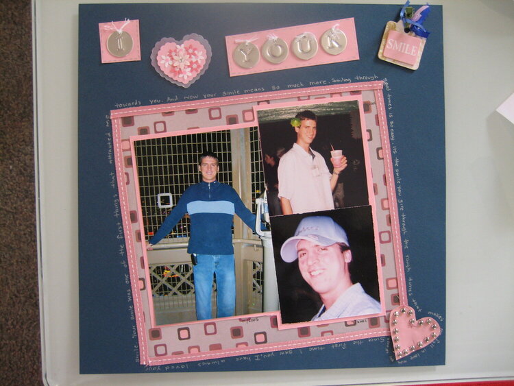
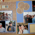
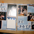
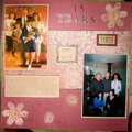
Here is my Week 11 Challenge - Photo Placement. I was having a heck of a time doing this, I must have spent a good 4 hours! lol
No products have been added to this project.
Thanks for spreading positivity!


March 21, 2007
March 19, 2007
March 19, 2007
March 19, 2007
March 19, 2007
March 19, 2007
March 17, 2007
March 17, 2007
March 17, 2007
March 17, 2007
March 17, 2007