FREE Standard Shipping on Orders $69+ with code:
FREESHIPPING

Cheers
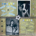
Give a Cheer

 Give a Cheer
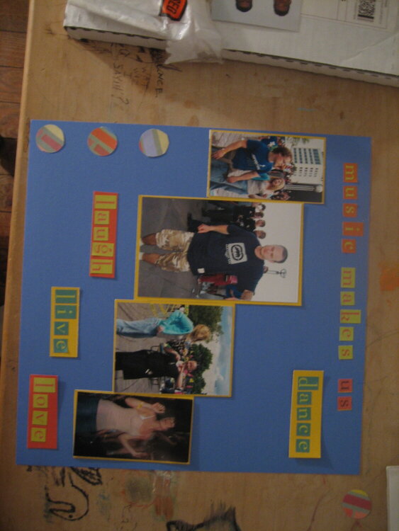
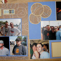
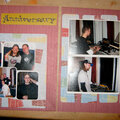
I redid this LO in a 12x12. Nothings stuck down. I feel it needs something not sure what.
No products have been added to this project.


Thanks for spreading positivity!


May 20, 2007
May 17, 2007
May 01, 2007
May 01, 2007
April 30, 2007
April 30, 2007
April 30, 2007
April 29, 2007