


Happy National Scrapbook Day!
Extra 10% OFF Select Scrapbooking Brands with Code: NSD24
Extra 10% OFF Select Scrapbooking Brands with Code: NSD24

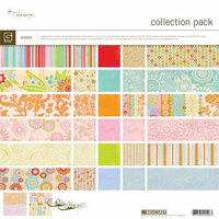
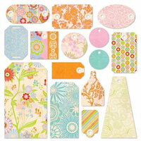
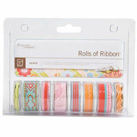
 Give a Cheer
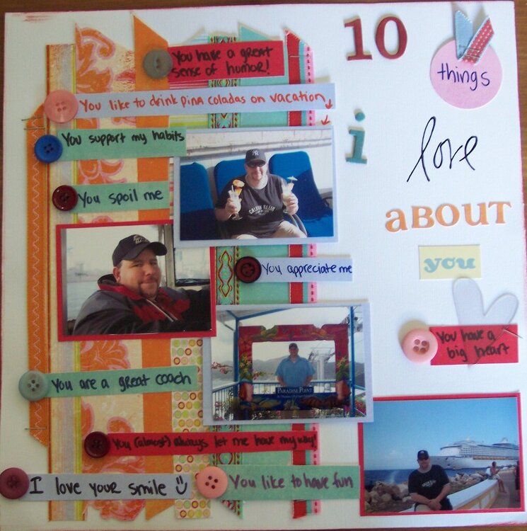
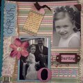
This is a layout about my husband.

Thanks for spreading positivity!


July 31, 2007
July 30, 2007
July 24, 2007
July 22, 2007
July 20, 2007
July 19, 2007
July 19, 2007
July 19, 2007
July 19, 2007